STREAMLINING
THE DELTA DENTAL WEBSITE EXPERIENCE
Delta Dental: Smoother User Flow

THE DESIGN CHALLENGE
Making it easier for the user to find a dentist
TIMELINE
6 weeks
ROLE
Lead UX Designer and UX Researcher
Working with insights from internal user research and the Delta Dental UX design team, the task was to create an easy way for new customers to find a dentist.
TOOLS
Figma, Miro, Google Suites Illustrator, Photoshop
UNDERSTANDING THE USER WITH THE RESEARCH
The Delta Dental Research and what it uncovered about their user.
Majority of users remained on the page for 5.3 seconds.
Calling Delta Dental instead of using the website after attempting to navigate it.
Users emphasized the importance of incorporating accessibility as a factor.


IDEATION
Our Process
Collaborating with the Delta Dental UX design team and utilizing insights from internal user research, we started with four simple solutions to help new customers find a dentist.
1
Beginning Selection
Simplifying the search process: The first screen displays the different plan options. Users can select their plan, then proceed to a filtered search to narrow down their choices.
Pros:
-
Simplifies the search process.
-
Allows users to see what options are available to them.
Cons:
-
Users without a plan cannot view available options.

2
Map Feature
The dentist map includes features showing transit routes, car and rideshare prices, and nearby garages. Color coding highlights route options, making it personalized for each user.
Pros:
-
Users don't need to know street names, just the area.
-
Usable by both transit riders and drivers.
Cons:
-
Maps may not be accurate due to construction and updates.
-
Transit changes might not be immediately reflected.

3
Name Hover
Initially, only the dentist's name, location, and hours are displayed. Additional details, such as languages spoken and public transportation options, are revealed when the user hovers over the name, providing more specific information.
Pros:
-
Streamlines the webpage by displaying only the most important information.
-
Makes it easier for the user to make a choice.
Cons:
-
Users may feel they don't have enough information.
-
Users may be unsure about their choices.

4
Simplified Amenities and Location Feature
The goal is to highlight the dentist, their location, accepted healthcare plans, and the services they offer.
Pros:
-
The simplified design helps avoid overwhelming the user.
-
Shows the user only the most essential information.
Con:
-
Users may feel overwhelmed.
-
the way information is presented doesn't effectively support their needs.

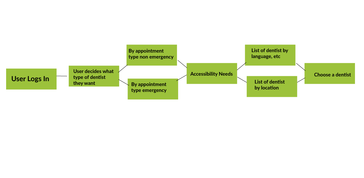
USER JOURNEY
AND WIREFRAMES
How The User Will Move Through The Site
Based on our research, we mapped the user’s "happy path" to help new users quickly find a dentist. We aligned their needs with a streamlined flow: starting with a plan selection, followed by a map view, and a list of dentists with key amenities.

MID-FI MOCKUP

Homepage
The search begins by selecting the type of appointment.
Filtering Page
Enable users to filter their search by age group and accessibility requirements, ensuring they find dentists that meet their specific needs.

CHANGES FROM THE USER RESEARCH FINDINGS AND STAKEHOLDER INPUT
The changes needed after user research with the Mid-Fi mockups and prototype.
Most didn't know the difference between emergency
and non-emergency appointment.
Users felt the separating of assistive needs on the start page was further othering the user.
All Users found they cared about location during an emergency appointment.
Services offered i.e.:
languages, times and dates were the considerations for non emergency visits.
The need to put the pages through
accessibility testing. Was top
of mind to the stakeholders
Stakeholders were interested users lack of knowledge about appointment types.
Stakeholders were excited about the use of a total flow from type to choosing the provider
HI-FI MOCKUP AND PROTOTYPE

Homepage
The search begins by selecting the type of appointment.

Filtering First Page
Allow users to filter search results by age group.

Filtering Second Page
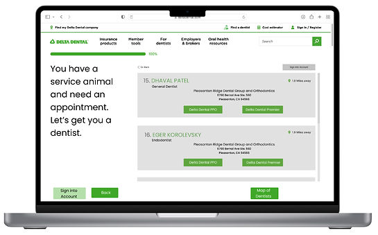
Allow users to filter search results by accessibility needs

A map displays nearby options for faster service.
Emergency Choice Page
Non Emergency Choice Page
A list of dentists with the option to view detailed information.
TITLE OF THE CALLOUT BLOCK
REFLECTIONS
Collaborating with Delta Dental's UX design team was both insightful and rewarding. Their user research provided the foundation our team needed to make informed, user-focused design decisions.
Embracing the research made the flow more inclusive and welcoming. Initially, I believed having two separate choices would only speed up the process, but I learned it had a much greater impact.
Working in a small group allowed me to enhance my communication and leadership skills while delivering a solution that addressed both stakeholder and user needs.
RESULTS
The team presented the prototype to stakeholders and received insightful feedback.
Stakeholders highlighted their appreciation for the clear user flow and the inclusion of accessibility as a filter.
NEXT STEPS
-
Introducing additional filters to simplify the process.
-
Enable patients to connect with their dentists through a chat feature.
-
Ensure responsiveness by integrating an app.